How I Doubled Chatbot Resolution Rate and Cut Agent Tickets 29% by Turning Sortly Sage from a Full Page into a Sidekick
When we shipped the full-page beta at 10% of users, it outperformed the old bot immediately. Users were also opening second browser windows to follow its instructions. That one behavior told me everything: accurate answers don't matter if the container fights the user.
The off-the-shelf bot was failing. The dev team replaced it with a quick-and-dirty full-page beta: no thoughtful UI, no UX, just a proof of concept using our help center documentation plus Claude Sonnet to validate response quality. At 10% of users, it outperformed the old bot. Good enough to ship. Not good enough to use.
I started with the full-page experience and immediately hit the fundamental problem: for "How to" questions, Sage was returning accurate, step-by-step instructions. But users couldn't follow those steps while staying in an open dialogue. They had to choose between reading Sage's answer and doing the thing Sage was describing. Most opened a second browser window. Some just closed the chat.

This was the V1 greeting screen — shown once, the first time a user opened Sage. Once they started a prompt and returned, the full page experience took over and they never saw it again.
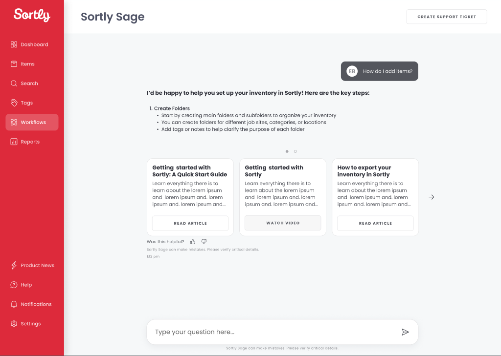
When a response had supporting content — help articles, videos, or gifs related to the prompt — it surfaced as a list in the chat thread. In V0 this was a list view that was very hard for users to see and navigate.
We tracked closely through Amplitude: what users asked, what they did after. Two patterns became undeniable: users needed to navigate Sortly while talking to Sage, not instead of it , and when Sage couldn't resolve an issue, they were being pushed out of the product to file a Zendesk ticket, re-entering information (email, username, company ID) that Sortly already had.
Version 1 was the full-page experience. Accurate responses, wrong container. Version 2 introduced a collapsible chat window. Better, but the ticket submission path still kicked users out of the product. CX stakeholders needed an in-product ticket flow; getting engineering alignment required surfacing the user cost of making someone re-enter their own account information to ask for help.

We expanded the FAQs section based on the questions users asked most in V1. The collapsed nav keeps the app fully accessible — no context switch required.

When Sage can't resolve an issue, the ticket is filed directly in the drawer — chat history attached, no product exit.
Sage became a sidekick, not a destination. Users can open it from anywhere in the product, follow instructions without losing the thread, and submit a support ticket without re-entering information we already have. The full-page experience was retired.
The solution that shipped was a persistent, collapsible Sage window accessible from any screen, with a direct ticket submission screen pre-populated with account data. Sage got a name, a brand identity (the owl icon), cards for external links and how-to videos, and a layout built to scale down to mobile from day one.
Once we started to see the results, the numbers didn't lie.
As the chatbot window gained more users, I kept tracking not just resolution rates but what Sage was actually handling. Each week I reviewed the conversations: what users asked, how Sage responded, where the answers were accurate. This is a representative week from December 2025 threads all resolved without agent handoff.
Sage wasn't perfect. The LLM occasionally fabricated instructions, and users would follow steps that were incomplete or flat-out wrong. Those failures were useful: they exposed gaps in the help center documentation, and fixing Sage's errors made the source material more accurate than it had been before Sage existed.